12 Tips to Build an Engaging B2B Homepage
The homepage of your website is your company's face to the world. We know that a big percentage of your potential customers look at your company's online presence before doing any business with you. If it is way too complex or confusing it will probably drive people away. Visitors assess the company's competence by its online presence. An organized, usable and reasonable website can add trustworthiness and competence to your company's reputation.
Nielsen Norman Group states that, "Website quality is equated to company quality in many customer's minds."
In fact, did you know that it takes the average visitor only a couple of seconds on a website to decide whether to stay on it, or go away? It’s critical for a website homepage to be high-impact and captivating enough to make visitors stay.

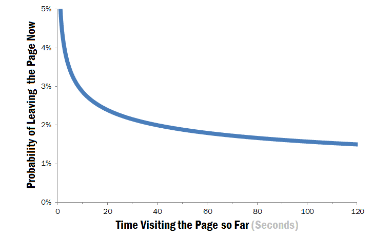
The impact of first impressions on visitor behavior is huge: studies show that the first several seconds are crucial for your visitors’ decision to stay or leave.
This graph from Nielsen Norman Group illustrates this well.

First few seconds of the page visit are of critical importance for the decision a user will make to either to stay or leave
Have in mind that it's not only important to make a good first impression on your homepage, but on all your website pages, because in many cases people are landing directly on them (e.g. product landing pages). We’ll focus on the homepage here, but most of our tips are applicable for the whole website.
So what can you do to ensure that you create a positive impression and keep most of your visitors around to check out your offerings? Here are 12 practical tips on how to build an engaging and well-performing homepage:
12 Tips for a High-performing Homepage
1. Ensure a high loading speed
Nowadays page loading speed is a rare problem for established B2B companies, but it is still worth mentioning. In fact, even before your visitors take a glimpse at your homepage, you can already influence their first impression. It's more or less common sense, but be sure that if your homepage (or other landing page) loads slowly, you will start the relationship with your visitors on bad terms. Last but not least, slow loading speed has a crucially negative effect on your SEO rankings.
2. Create relevant and attractive visual design
Visual design has the remarkable function to assist visitors filter good from bad hits. As a user, would you trust an organization that has a sloppy, chaotic website? What message does design like that send about the company behind it? Your homepage visual design impacts the audience's perception of your organization. Don't forget people also have specific expectations for what websites should look like depending on the area, business or topic. Picture this—you are searching for CRM software and you come across a website that has numerous blinking, bright icons, music playing in the background and a mouse trail following your every click. You probably wouldn't trust this company to answer your needs as a customer. People expect websites to reflect a company's philosophies.
3. Simply put: What’s your site all about?
You have only several seconds to keep your visitors' attention on your homepage, and the first thing every new visitor needs to know is what the website is about. In other words, the “who,” “what” and for “whom” are the things first-time visitors check out first. If they are unable to understand that, it's more likely they won't spend a lot of time on your site. If you’re a famous brand or company maybe you won't be subject to this pressure, but most companies need to answer these basic questions so that visitors know where they are and why they are there. Your homepage is the perfect place to clearly state your value proposition—or what can customers expect from you, and why they should trust and choose you over all of your competitors.
4. Write great copy that resonates with your target audience
Good copy is a powerful tool to engage and eventually gain your visitors' trust. A homepage needs to speak to the right people in their own language. You don’t build a website for you, you build it for your customers. Customers should be the center of your website Solar System. Word your homepage from their point of view, address their needs and solve their struggles. Make sure your content is scannable, objective and to the point. Help your visitors trust you by avoiding clichés and keeping it simple. Web copy is good when there's no excess.
5. Reduce friction
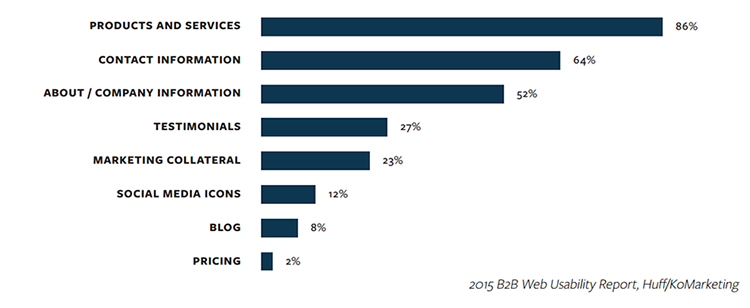
Build a clear information architecture with a clear and intuitive navigation. Provide an easy path to your products or services and company information. Here is a diagram showing what visitors are most often looking for when they land on a B2B homepage:

Information people want to see available on a B2B website homepage
Do not neglect to include clear paths to some of the most important pages in the B2B websites like:
a. Contact Info/Office Locations—It can be really frustrating when you are trying to connect to a company but struggle to find their contact information. Most B2B customers use the web during the initial research phase to vet potential vendors, then follow up with a telephone call or by filling a contact form
b. Investor Relations—For publicly listed B2B companies, the relationship with their current or potential investors is crucially important
c. Careers—Every growing or established B2B company has the need to fuel its human capital with new recruits
Think about how messaging flows across the homepage. If it’s fluid and logical, it will keep people on the page. If it’s confusing or chaotic, it will repel visitors.
6. Provide clear directions
Make sure you provide your visitors with clear direction on what they should do next. Call to action buttons are one of the most used instruments for directing your visitors throughout your homepage. Here are a few quick tips on creating good CTA buttons:
a. Use explicit copy—Clearly state exactly what your visitor will get if they click it. Avoid using "Learn more," "Read more" and similar
b. Avoid competing CTAs—People are less likely to take action when they are presented with multiple "equivalent" choices. Psychologists call this choice overload. If you need to offer multiple CTAs, prioritize them visually—for example, make one more visually striking.
c. Test and optimize regularly—A/B testing is one of the best approaches to test which CTA button works best
In addition to CTAs, you can also use different design principles to drive the user (Steven Bradley has a great 7-article series about these topics on Smashing Magazine). Check out a great article in our blog about the surprising potential of peripheral vision in driving user attention.
7. Personalize it
Nowadays providing a personalized experience for your customers is more important than ever before. Technologies have evolved dramatically over the last few years, and you can easily create personalized messaging and differentiated experiences to increase customer satisfaction, build loyalty and acquire new customers. Learn more in our recent post on how to put personalization work for you.
8. Avoid “happy people” stock photos
Pretty, smiling people, brightly lit backgrounds, dummy situations. You can always tell a stock photo is a stock photo. These are unconvincing and too general to elicit an emotional response, which is the basis of good connection between your website and your visitors. Stock photos can hurt your credibility, make your content less effective and cost a large amount of money. They might do the job if you are looking for real photos on a budget, but are not recommended as a permanent solution. Original, genuine visuals are the best choice and will engage your visitors much better than a stock photo ever will.
9. Show proof and bring credibility
People coming to your homepage will be interested in whether someone else trusts you and has used what you offer. According to The 5 Paths to Persuasion (by Robert B. Miller and Gary A. Williams) 91% of decision makers need some kind of proof before making a complex decision. Here are some "tools" you can use to bring more credibility to your company:
a. Success stories—In a few words or numbers show how your offerings have positively impacted another company
b. Testimonials—Include real testimonials, by real people with their real photos
c. Logos/Customers—Add a set of logos of recognizable companies in the industry
d. Awards—List awards you earned from well-recognized and legitimate sources
These elements are also very good real estate for personalization. E.g., if the success story comes from a company in your industry, it provides additional reassurance to your visitors.
10. Ensure a great mobile experience
Let’s get the definition of mobile in this context clear: by mobile we mean a very wide range of screen sizes that span from small-screen smartphones to tablets. In the world of technology we live in, where you can access almost everything on your mobile device, not having a homepage optimized for mobile will make your business lag behind. A good mobile experience ensures your site can be properly accessed no matter the device a visitor is using.
11. Do not underestimate the footer
Footers are like safety nets, catching visitors before they hit the bottom of the homepage. They are very powerful in helping users explore and find their way around your website seamlessly. Rather than diving into this here, you may want to check out our recent post on what makes a footer good, from how we decide how big our footer should be to what information to include.
12. Never stop testing, measuring and developing
Crafting a well-performing homepage is not a single act, but a process that doesn't end. Measure its effectiveness based on predefined KPIs, conduct usability tests regularly and test your content or just experiment with any hypothesis that you think would improve performance. There are many techniques that come in handy here:
a. 5 second test
b. Usability testing
c. Heatmap analysis
d. Heuristic analysis
e. A/B testing
By the way, do you know the story of the young man, who made Obama President by using A/B testing?
What Not to Do
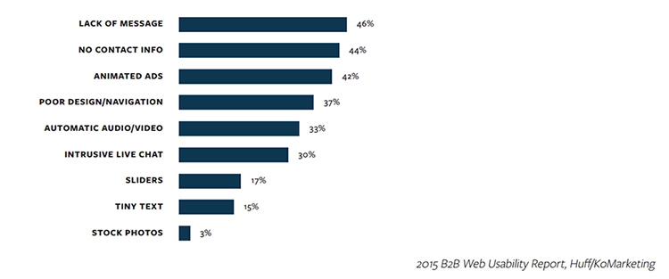
Before this article finishes, we want to show you a simple diagram, picturing the most annoying homepage elements that cause buyers to leave, according to a research by Huff/KoMarketing.

Website elements that annoy buyers and cause them to leave
Learn from these Top B2B Homepages
In conclusion, we would like to provide you with a list of several great B2B homepages that will inspire you as you build an engaging and well-performing homepage:
![[684a4f23-5482-43bb-bb75-5e328aeeb6e7]Daniel-Stoyanov](https://d117h1jjiq768j.cloudfront.net/images/default-source/blogs/blog-authors/-684a4f23-5482-43bb-bb75-5e328aeeb6e7-daniel-stoyanov.jpg?sfvrsn=69106ceb_6)
Daniel Stoyanov
Daniel has 9+ years of experience in the field of creating usable and effective UI solutions. Over the course of his career, he designed user experiences for a variety of web and desktop-based software products, intranet systems and websites. He is passionate about creating UX concepts and strategies that form the foundation of reliable, usable and effective products and strongly believes that usually the best solutions are the simplest ones. He dedicates his spare time to motorsports—both watching and practicing.
Comments
Topics
- Application Development
- Mobility
- Digital Experience
- Company and Community
- Data Platform
- Secure File Transfer
- Infrastructure Management
Sitefinity Training and Certification Now Available.
Let our experts teach you how to use Sitefinity's best-in-class features to deliver compelling digital experiences.
Learn MoreMore From Progress
Latest Stories
in Your Inbox
Subscribe to get all the news, info and tutorials you need to build better business apps and sites
Progress collects the Personal Information set out in our Privacy Policy and the Supplemental Privacy notice for residents of California and other US States and uses it for the purposes stated in that policy.
You can also ask us not to share your Personal Information to third parties here: Do Not Sell or Share My Info
We see that you have already chosen to receive marketing materials from us. If you wish to change this at any time you may do so by clicking here.
Thank you for your continued interest in Progress. Based on either your previous activity on our websites or our ongoing relationship, we will keep you updated on our products, solutions, services, company news and events. If you decide that you want to be removed from our mailing lists at any time, you can change your contact preferences by clicking here.

