Responsive Design for the Sitefinity Forums
The content you're reading is getting on in years
This post is on the older side and its content may be out of date.
Be sure to visit our blogs homepage for our latest news, updates and information.
In my previous blog post I showed you how to extend the responsive design feature in Sitefinity CMS by styling the Dashboard for devices with higher dimensions. In this blog post I have prepared for you some more cool responsive styles. This time for the Forums module. The styles you will see here are an addition to the Basic front-end theme, so you can add them to the page with a css widget, with a link on a master page, or in your theme respectively.
Our stylesheet starts with some general styles for the body and the wrapper. We set the width and padding of the sfPublicWrapper div in percents, to make sure they will adjust, depending on the parameters of the device you're using to view the forum.
body, form { width:100%; min-width:0;}.sfPublicWrapper { width:92%; padding-left: 3%; padding-right: 3% ; margin-top: 0;}Then we increase the font-size a bit:
.sfforumThreadsList { font-size:13px;} .sfforumPostBreabcrumbWrp, .sfforumsFilterWrp { font-size: 14px;}The forums widget practically consists of three views - Forum list, Thread list and Posts list. All of them contain tables, displaying basic information about the content type. Since we don't want to flood the mobile screen with too much information, we will remove some columns, as well as the RSS feed link. The best way to remove the columns is not only to declare display:none, but also to set the width to 0 and reset the paddings and margins:
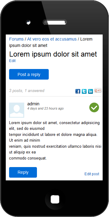
.sfforumThreadsList tbody .sfforumThreadPostsWrp,.sfforumThreadsList tbody .sfforumThreadViewsWrp,.sfforumThreadsList thead .sfforumThreadPostsWrp,.sfforumThreadsList thead .sfforumThreadViewsWrp { width:0; padding:0; margin:0; display:none;}You will notice a significant change in the Forum posts view, where the text doesn't stand on the right side of the page anymore, but it falls under the avatar and the user information. We achieve this by floating the sfforumThreadPostContentWrp and clearing the float with clear both. This way no elements will stand on the right or the left side of the content.
.sfforumThreadPostList .sfforumThreadPostContentWrp{ margin-left:0; float:left; clear:both;}We order the content of the .sfforumThreadPostUser div (the avatar image, username and and post information) with positioning by setting position:relative to the parent .sfforumThreadPostUser and position:absolute to the avatar.
.sfforumThreadPostList .sfforumThreadPostUser .sfforumUserAvatarWrp { width:50px; height:50px; position:absolute; top:0;}Also, to make sure that our design won't break when the user name is long, we set overflow:hidden and text-overflow:ellipsis to the user name div.
When an answer to a forum thread is found a user can set the post to "Answered". In the mobile version we replace the "Answered" link with a check icon.
.sfforumThreadPostList .sfforumPostMarkFeatured,.sfforumThreadPostList .sfforumPostUnmarkFeatured { background: transparent url('sfForumsResponsive.png'); height:32px; width:32px; color:transparent; display:inline-block;} .sfforumThreadPostList .sfforumPostMarkFeatured { background-position: 0;}.sfforumThreadPostList .sfforumPostUnmarkFeatured { background-position: 32px 0;}There is a grayed out image beside each post that wasn't marked as Answered and a bright green icon for the answers. For this functionality we use a sprite, containing the green and the grey images.
We also add some fresh styles to all forum buttons with the following css.
.sfforumReplyBtn,.sfPublicWrapper .sfforumNewThreadLnk,.sfSubmitBtnWrp input.sfSubmitBtn{ -webkit-appearance: none; -moz-appearance:none; background-color: #006CD8; border: 0 none; border-radius: 4px 4px 4px 4px; color: #FFFFFF; cursor: pointer; display: inline-block; font-size: 112.5%; line-height: 1.5em; margin-bottom: 0; padding: 8px 25px; text-align: center; vertical-align: middle; font-size: 112.5%;}Notice the lines:
-webkit-appearance: none;-moz-appearance:none;These declarations reset the default styles of inputs on mobile devices and allows us to style them the way we want.
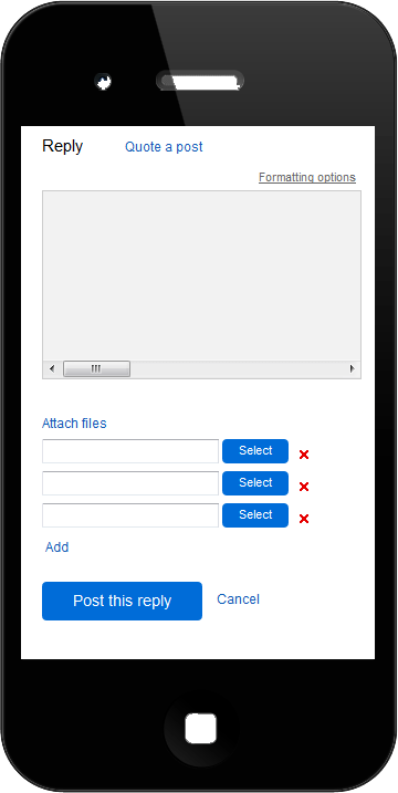
Another important change that should be mentioned is how the new thread and new post dialogs look like. With the Basic theme these dialogs are set fixed to the browser screen and you are able to scroll the list of posts/threads behind them. In our responsive design we expand the dialogs to the whole width and height of the device with this css:
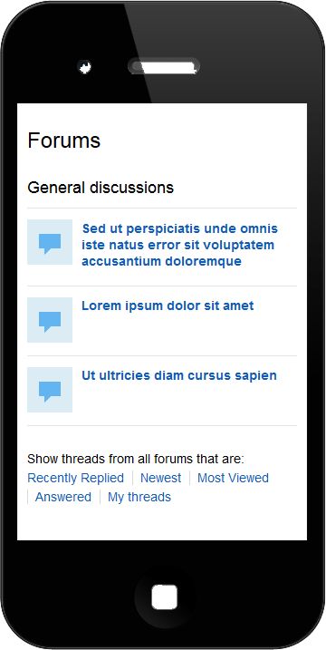
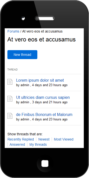
.sfforumReplyFormVisible .sfforumPostReplyContainer { position: absolute; height: auto !important; top: 0; bottom: 0; padding:10px;}There are some other small modifications that you will find in the responsive design css file, attached to this post, but hopefully they'll be easy to figure out. Here are a few images, demonstrating how the forums look like with my style. Hope you'll like it!


Limitations: Because of a bug with the RadEditor, scroll bars will not appear under iOS when you have a large post to edit or submit. The bug is logged for fixing by our colleagues from the RadControls team. You can track its status here. This problem doesn't get reproduced on devices running Android.

Comments
Topics
- Application Development
- Mobility
- Digital Experience
- Company and Community
- Data Platform
- Secure File Transfer
- Infrastructure Management
Sitefinity Training and Certification Now Available.
Let our experts teach you how to use Sitefinity's best-in-class features to deliver compelling digital experiences.
Learn MoreMore From Progress
Latest Stories
in Your Inbox
Subscribe to get all the news, info and tutorials you need to build better business apps and sites
Progress collects the Personal Information set out in our Privacy Policy and the Supplemental Privacy notice for residents of California and other US States and uses it for the purposes stated in that policy.
You can also ask us not to share your Personal Information to third parties here: Do Not Sell or Share My Info
We see that you have already chosen to receive marketing materials from us. If you wish to change this at any time you may do so by clicking here.
Thank you for your continued interest in Progress. Based on either your previous activity on our websites or our ongoing relationship, we will keep you updated on our products, solutions, services, company news and events. If you decide that you want to be removed from our mailing lists at any time, you can change your contact preferences by clicking here.

