Anatomy of a Sitefinity 4 Widget
The content you're reading is getting on in years
This post is on the older side and its content may be out of date.
Be sure to visit our blogs homepage for our latest news, updates and information.
We previously looked at a quick “Hello World” example of a Sitefinity Widget and Control Designer. Today I would like to take a closer look at the different components and options available when building widgets.
I hope this will give developers a deeper understanding of the architecture to make developing widgets easier. Later in a followup post, we’ll dive deeper by building a real-world widget that demonstrates the advanced features and capabilities of a widget and control designer.
Two Sides of the Same Coin
A Sitefinity widget is made up of two major components.
Public Widget
The widget itself represents the public, front-end functionality that the end user interacts with on the website.
Widgets are generally made up of different html and ASP.NET elements, such as textboxes, buttons, and even Telerik controls like RadGrid. Basically anything you can do with a standard ASP.NET control you can do with a widget.
Widget Administration
The other half of a Widget is the admin, back-end functionality that the page creator uses to set the widget properties. This part of the widget is called the Control Designer.
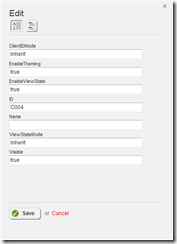
By default, Sitefinity an internal service to automatically create a default control designer, listing all public properties of the widget as simple textboxes.
It is, of course, possible to create your own control designers so that page creators have a better experience while setting widget properties. We’ll take a look at that shortly.
Widget Types
There are two types of widgets that differ only in how they are compiled and distributed. In a future post, we will build both types, starting first with the Simple Widget, then showing how you can easily convert it into a Compiled Widget.
Simple Widget (User Control)
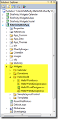
By far the most common is going to be a Simple User Control Widget, which is simply a standard ASP.NET User Control (.ascx file). These are added directly into your Sitefinity web application project and are referenced by the physical path to the control.
The advantage of this type of widget is that it is immediately available to your Sitefinity project, and gets compiled and distributed right along with it. There are no external references or dependencies, and it’s the quickest way to build and use your widget.
However, because these controls are built and compiled into the host project, they are not designed to be easily distributable. To run them in another Sitefinity site, you need to copy all of the widget files, including any additional resources (such as images, templates, class files, etc.).
Compiled Widget (Custom Control)
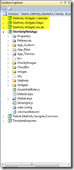
If you are building a widget with the intent to reuse or easily distribute it to different Sitefinity sites, it is recommended that you create a Compiled Widget. This is analogous to a custom control in ASP.NET, where the control and all of its resources are defined in a separate project and compiled into a single DLL library.
In fact, the difference between a Simple Widget and a Compiled Widget is exactly the difference between an ASP.NET User Control and Custom Control. Instead of adding the control files and resources to the Sitefinity project, you add them to a separate class library.
Resources (such as images and the ascx template file) are embedded into the control and compiled into the DLL.
The advantage here is obviously the ease of distribution and reusability. Conversely, these widgets can take additional time to develop as they must be designed to work independently of any site in which they are used.
Control Designers
As mentioned, control designers make up the Administrative elements of a widget, allowing the page creator to set the widget properties in a simple interface.
The control designer uses JavaScript to load and persist properties from the widget to the designer editor and vice-versa.
There are three flavors of Control Designers.
Default Control Designer
If no control designer is defined for a widget, Sitefinity will an internal service to create a basic interface that will list all the public properties of a widget as textboxes.
This can be sufficient for simple widgets that either have simple or no public properties, or if the properties of the widget will never need to be changed. However, for a better user experience you can certainly build your own.
Simple Control Designer
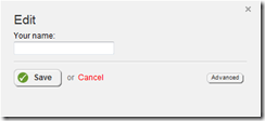
The simplest and most common type of control designer consists of a single view on which you define an editor for the various properties of the widget.
Using a simple control designer, you can create a complete custom editor to set any properties of a widget in a clean, user-friendly interface, as well as exclude properties that you do not want modified or shown to the end user.
Multi-View Control Designer
This is an advanced control designer that is mainly used for very complex widgets. The best example is the control designer for the different content views such as News, Events, etc.
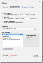
It consists of several different Designer Views through which the user can toggle. For example, the News View widget contains three views: one for selecting the content, one for the List View settings, and finally one for the Single Item (detail view) Settings.
Each of these views are developed separately and loaded by the main control designer.
For the most part, the Simple Control designer is sufficient for most needs, as the Multi-View designer was designed specifically for use with Content Items, and you would likely only need it if you are developing a custom content-based module.
Fortunately, there is a default, generic and reusable control designer available for you to use in your custom content-based modules. We’ll take a look at that in a future post as well.
Components of a Widget
Whether building a Simple or Compiled widget, you’ll need the following components.
1. Public Widget Control
The primary component of the widget is the control itself, defined either as a standard .ascx User Control (and its associated code-behind file) or a compiled user control (and it’s associated ascx template file).
Note: If you are creating a Compiled Widget, the control must inherit from SimpleView.
2. Control Designer Class
This is the class file that defines the control designer and is used to wire up all of the designer elements below to the designer. It must inherit from ControlDesignerBase.
3. Control Designer Template
The template is an ascx file that represents the actual editor that will be displayed to the user. It is made up of standard HTML elements that map to the properties of the widget.
For example, a Widget might have a “Name” property. On the template, you could display a text input box named “Name”.
4. Control Designer JavaScript File
Control Designers use JavaScript to pass information from the widget to the editor template, and again to persist the changes from the editor template back to the widget.
For the script file to function properly it must do the following:
- Register the namespace of your widget so it can be referenced using JavaScript
- Initialize a client-side instance of the designer
- Define the events that need to be handled by the designer and the actions to be taken at each event (see below)
- Register the client-side class so it can be used by the designer template
For the most part, steps 1, 2, and 4 are done with boilerplate code that only need to be customized with the namespace of your widget.
The key component of the script file is in step 3, which is defining the relevant client-side events that load and persist the Widget properties back and forth between the designer template and the Widget itself.
There are four important events to define:
- initialize: default initializer; if you need to setup variable or other controls on page load (such as loading external libraries or setting up global variables) you can define them here
- dispose: default destructor; if you need to dispose of items or call a function on close, you can define that here
- refreshUI: This is used to load the properties from the Widget and map them to the html template so they can be edited.
- applyChanges: This is called when the changes are saved in the template, mapping the values back to the Widget
If you look at Gabe’s example, or indeed any Widget example that has a control designer, you’ll see that the actual work of loading the data from and persisting the data back to the Widget is done in refreshUI and applyChanges, respectively, using jQuery.
When loading the control, we populate the html elements from the backing control (example taken from Gabe’s Hello World Widget):
refreshUI: function () {
    var controlData = this._propertyEditor.get_control();

    // bind widget properties to designer jQuery("#txtName").val(controlData.Name);
},
And when saving, we save the html values back to the Widget:
applyChanges: function () {
    var controlData = this._propertyEditor.get_control();

    // bind designer properties back to widget controlData.Name = jQuery("#txtName").val();
}
We’ll take a look at handling other html elements (drop downs, checkboxes, etc.) in our next post.
Putting It All Together
Now that you understand the different components that make up a widget, let’s look at how they interact and how you put them all together to make a complete widget.
Link the Widget to the Designer
First, the widget class itself needs to be associated with the control designer. This is done with an attribute that links the widget with the type of the designer.
For example, in Gabe’s Hello World example, the widget class was HelloWorld, and the Control Designer class was HelloWorldDesigner. So to link them together, add the following attribute to the widget class:
[ControlDesigner(typeof(HelloWorldDesigner))] public partial class HelloWorld : System.Web.UI.UserControl{

}
Set Designer to Simple View
This simply tells the Designer to use our custom view, instead of the default one that Sitefinity generates. Override the InitializeControls() method in the Control Designer Class to set this:
protected override void InitializeControls(Telerik.Sitefinity.Web.UI.GenericContainer container)
{
    base.DesignerMode = ControlDesignerModes.Simple;
}
Link the Designer to its Template
The Designer Template Class needs to know what template file to load. This is done using the LayoutTemplatePath property.
This path will differ depending on whether you are developing a Simple or Compiled Widget. For a Simple Widget, simply define it using the path to the template:
private string _layoutTemplatePath = "~/Widgets/HelloWorldDesigner.ascx";
public override string LayoutTemplatePath
{
    get { return _layoutTemplatePath; }
    set { _layoutTemplatePath = value; }
}
For a Compiled Widget, you’ll need to use the resource path defined by your custom control. We’ll take a look at this in more detail in a future post, but here is an example from the LikeBox widget taken from the Non-Profit Starter Kit in the Sitefinity SDK:
public override string LayoutTemplatePath
{
    get {
        return Resources.VirtualPathPrefix + LayoutTemplateReference;
    }
    set {
        base.LayoutTemplatePath = value;
    }
}
private const string LayoutTemplateReference = "Sitefinity.Widgets.Social.Facebook.LikeBox.LikeBoxWidgetDesignerTemplate.ascx";
Register Control Designer Script
This is handled similarly to mapping the template. Simply override the GetScriptReferences() method and supply the path to the JavaScript file.
Again the path depends on the type of widget (Simple vs. Compiled) you are developing. Here is the example from Gabe’s Hello World example:
private string _scriptReference = "~/Widgets/HelloWorldDesigner.js";
public override IEnumerable<ScriptReference> GetScriptReferences()
{
    // get script collection var scripts = base.GetScriptReferences() as List<ScriptReference>;
    if (scripts == null) return base.GetScriptReferences();

    scripts.Add(new ScriptReference(_scriptReference)); return scripts.ToArray();
}
Register the Control
At this point, everything should be configured and wired up for use on your Sitefinity pages. Follow the instructions for registering a Sitefinity widget in the toolbox and you can now add your control to the page, complete with your custom designer!
What’s Next
This article should hopefully give you a more complete idea of everything that is involved in developing a widget from start to finish. In our next post, we’ll take a look at a real-world example, complete with a complete, real-world widget example that makes use of different elements such as drop-downs, checkboxes, and other Sitefinity controls.
In the meantime, feel free to weigh in your comments, questions, and suggestions to our Developing with Sitefinity discussion forum.

The Progress Team
View all posts from The Progress Team on the Progress blog. Connect with us about all things application development and deployment, data integration and digital business.
Comments
Topics
- Application Development
- Mobility
- Digital Experience
- Company and Community
- Data Platform
- Secure File Transfer
- Infrastructure Management
Sitefinity Training and Certification Now Available.
Let our experts teach you how to use Sitefinity's best-in-class features to deliver compelling digital experiences.
Learn MoreMore From Progress
Latest Stories
in Your Inbox
Subscribe to get all the news, info and tutorials you need to build better business apps and sites
Progress collects the Personal Information set out in our Privacy Policy and the Supplemental Privacy notice for residents of California and other US States and uses it for the purposes stated in that policy.
You can also ask us not to share your Personal Information to third parties here: Do Not Sell or Share My Info
We see that you have already chosen to receive marketing materials from us. If you wish to change this at any time you may do so by clicking here.
Thank you for your continued interest in Progress. Based on either your previous activity on our websites or our ongoing relationship, we will keep you updated on our products, solutions, services, company news and events. If you decide that you want to be removed from our mailing lists at any time, you can change your contact preferences by clicking here.
