Sitefinity CMS Responsive Web Design
Use a Mobile CMS with Responsive Design to Optimize for Any Device
Built-in Responsive Design Engine
You don’t need a “mobile-version” of your website to be “mobile-friendly.” Sitefinity content management system lets you adapt your current website to any device with Responsive Design. Define transformations that automatically optimize your website for each visitor’s unique screen using “drag & drop” layouts and responsive rule-sets.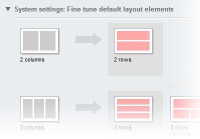
Built-in Responsive Layouts
Sitefinity includes “drag & drop” layouts that can be quickly placed onto any page or template. These layouts are DIV-based, not TABLE-based, and fully aligned with HTML best practices. Once placed, Sitefinity becomes aware of the layout structure applied to your webpages, and through adaptive rule-sets, can optimize these layouts for the mobile web.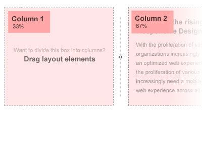
Preview for Mobile Devices
By using Responsive Design, Sitefinity allows a single web experience to be optimized for an unlimited number of devices. These optimizations can be previewed and tested using a built-in emulator that simulates how the page will be transformed for smartphones and tablets. Supported devices include: iPhone, iPad, HTC Incredible, Samsung Galaxy Tab, and more.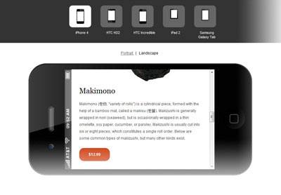
Backwards Compatible
Sitefinity’s mobile web support is based on Responsive Design, and this technique is supported by most desktop computers and nearly all mobile devices. However, devices that do not support this technique will simply retrieve the “default” experience for your website. By using progressive enhancement techniques, this experience remains completely accessible to older browsers.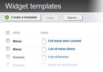
100% Standards Compliant
Responsive Design is based on web standards and supported in all modern web browsers. It's based on a technology called “Media Queries” that was outlined in the W3C CSS3 (Cascading Style Sheet) specification. Media Queries allow different styles to be specified for different devices, and Sitefinity connects these styles to your website to generate fluid layouts.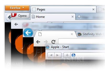
Full Control of the HTML
Limited control of the website’s markup results in limited control of the website’s design. This limited flexibility can be crippling when creating responsive web experiences. Thankfully, all content in Sitefinity is template-driven (page templates and widget templates), giving you full control over the HTML that is rendered to the visitor’s web browser.